Archive | March 2024

Attrition % in a Line Chart

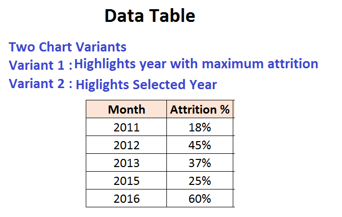
There are two variants of this chart

  • Highlighting the year with maximum attrition
  • Highlighting the selected year.

The user can adopt this chart and create more variations like years having above attrition highlighted or separating a yearly attrition across departments /locations and then highlighting the department/location with highest attrition.

Download-File-Line-Attrition


Sales Data – From a particular month to a particular month.

In this example we have the monthly sales data.We have two combo box denting the from date and to date.

The resultant chart represents sales data for the selected period.

If the user selects a From Month which is after the To Month.

In this scenario, the resultant chart will show sales for the entire year( January to December).

Download Chart From Date -To Date