Attrition is the loss of human resources in an organization. A high attrition rate is a cause of concern for organization. It is a reduction in the manpower strength of an organization. Attrition can be voluntary or involuntary.
Voluntary attrition is due to resignation by the employee due to personal reasons, growth prospects, health problems etc.
Involuntary attrition includes retrenchment, layoff, terminations etc.
Steps for calculating attrition rate
E.g. : Attrition Rate for 2016 . (We are considering calendar year 01 Jan 2016 to 31 Dec 2016)
Calculate the below
- Opening Count: This is the number of employee who are active at the start of your assessment period. Your opening count will be employees who were active as on 01 Jan 2016.
- Newly Joined: These are the employee who have joined in your assessment period. ( 01 Jan 2016 to 31 Dec 2016)
- Resigned: These are the employee who have left in your assessment period. ( 01 Jan 2016 to 31 Dec 2016)
- Closing Count: (Opening Count + Newly Joined) – Resigned.These are the employees who remain active at the last day of the assessment period.
The closing count for 2016 will become the opening count for 2017.
Formula
 Example


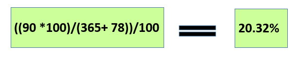
Verification
Opening Count was 365 . New Joined was 78. So now we have a total of 443 employees. The attrition percent is 20.32%. So ( 443 * 20.32%) = 90. Hence it matched our resigned employees.
The alternative formula generally used in calculating attrition is as under:
(( Resigned / Average Head Count))*100
Here average head count is (( Opening Count + Closing Count )/2)
However there will be a slight difference in the attrition value as we average our total employee count.( As per second formula the attrition value comes to 22.6 %)
As a personal preference ,I always use the first formula.
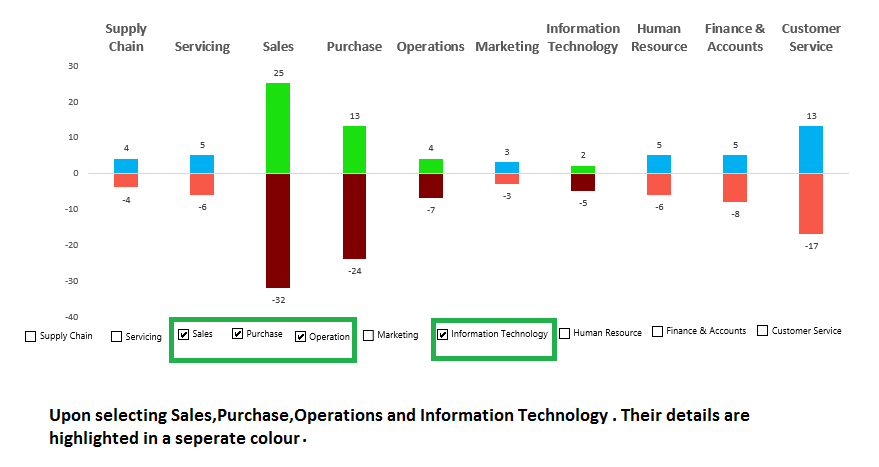
You can further use the above formula and bifurcate attrition percentage across departments, locations, Gender, Grades etc.
Excel Charts for Attrition
The Joinee , Resigned and Attrition data can be plotted in different charts formats.
Example 1

Example 2

Example 3


Example 4

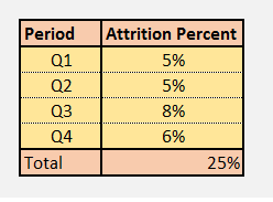
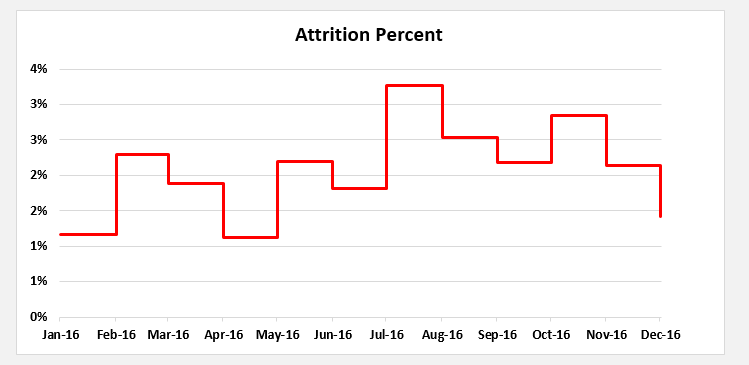
Attrition Data Monthwise.
The Data Set is as below:


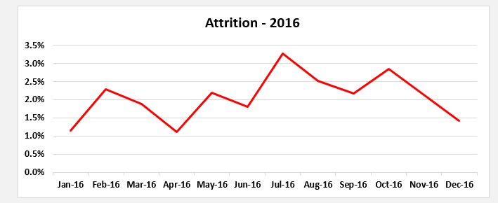
The above data can be represented in various chart formats as under:
Example 1

Example 2

Example 3